

Of maps and men: redressing a centuries-old cartographic lie
.jpg)
For nearly five centuries, humanity has stared at a lie hanging on the walls of its classrooms, printed across its atlases, and rendered in pixels on the digital devices resting in its palms. It is a lie written in ink and gridlines, one that quietly instructs generations of school children that the Global North is vast, dominant, and central, while the Global South - most notably the African continent - is diminished, peripheral, and visually subordinate.
On September 4, 2026, the United Nations General Assembly took a historic step toward dismantling this long-standing visual distortion. In a landslide vote of 164 to 1, endorsing an initiative spearheaded by Togo on behalf of the African Union, the UN adopted resolution A/80/L.104, titled “Correct the Map”. The only Nay vote came from the USA.
The resolution formally encourages governments, academic institutions, media outlets, and technology companies worldwide to phase out the centuries-old Mercator projection in favor of equal-area map projections, specifically pointing to the Equal Earth projection developed in 2018. As Togolese Foreign Minister Robert Dussey remarked before the General Assembly: “A fair map does not change the geography of the world, it changes how we see the world.”
This move is far more than a technical adjustment or a dispute over geometry; it is an act of long-overdue cognitive justice. It is, in my view, another step in the right direction for the global Reparations and Reparatory Justice movement that has seen the African Union and CARICOM come together in an unprecedented fashion to advance a common cause.
To understand why cartographic accuracy matters, we must look beyond paper and screens to examine the mathematical distortions, the geopolitical consequences, and the imperial legacy that shaped the way we view the globe.
The Science of the Lie: Using Geometry to Shrink a Continent
For us to see how Africa was visually diminished, we must understand the geometry of cartography. Translating a three-dimensional sphere onto a two-dimensional flat surface is a mathematical impossibility; it cannot be achieved without any compromise. Every map projection must sacrifice something: shape, area, distance, or direction.
In 1569, Flemish cartographer Gerardus Mercator created a map designed for maritime navigation. The Mercator projection was an effective tool for 16th-century European sailors because it preserved angles and directions, thus allowing navigators to draw straight lines across oceans to plot accurate compass courses.
However, preserving shape and directional accuracy required a severe mathematical trade-off: area distortion that increases dramatically as one moves away from the Equator toward the poles.
Because Africa straddles the Equator, it sits precisely where the Mercator projection compresses landmasses relative to higher latitudes. Meanwhile, northern territories in Europe and North America are completely blown out of proportion. The visual consequences of this distortion are staggering:
In reality, Africa is immense beyond conventional imagination. It encompasses 30.3 million square kilometers. You can fit the entire contiguous United States, China, India, Japan, Mexico, and almost all of Western Europe inside the African continent all at once, and still have millions of square kilometers to spare. Yet, on standard Mercator wall maps, North America appears larger than Africa, and Western Europe appears to have a commanding central presence.
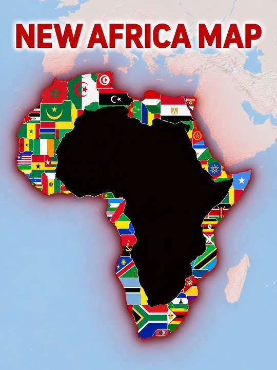
The Berlin Conference of 1884- 1885: From Cartographic Distortion to Physical Balkanization
The misrepresentation of space has never been politically neutral. Maps do not merely describe power; they construct it. The visual minimization of Africa went hand-in-hand with its physical exploitation. When European imperial powers convened at the Berlin Conference of 1884–1885, cartography was weaponized as a tool of conquest. Representatives of fourteen nations sat around tables in Berlin, armed with maps that depicted Africa as an empty, manageable expanse waiting to be shared among themselves like a wild animal they had just hunted. The Mercator map’s psychological reduction of Africa made the continent appear smaller, more compact, and easier to carve up.
Without a single African representative present, diplomats drew arbitrary straight lines across thousands of miles, slicing through distinct ethnic groups, kingdoms, ecosystems, and natural trade corridors. This deliberate balkanization created artificial nation-states designed not for organic self-governance, but to facilitate resource extraction and maintain colonial control.
A lot of the problems facing modern African nations today can be traced to this one greedy colonial act.
The imperial powers used maps to diminish Africa twice: first on paper, by shrinking its physical presence in the global mind, and second on the ground, by fragmenting its land and peoples into vulnerable geopolitical pieces. The psychological link between these two acts is undeniable. A continent rendered small and marginal on paper is easier to dismiss as small and marginal in political and economic importance.
The Digital Perpetuation: Google Maps and the Tech Monopoly on Perception
While the 19th-century imperialists relied on paper maps, the 21st-century global citizen relies on digital platforms. Herein lies the most frustrating chapter of this cartographic tragedy: the perpetuation of the Mercator bias into the digital age.
When tech giants like Google, Apple, and Microsoft digitized global mapping in the early 2000s, they adopted Web Mercator as their standard default projection. While Web Mercator offers smooth panning and zooming for local street navigation because it preserves 90-degree street angles, its global view retained the same severe distortions that inflated North America and Europe while shrinking Africa.
For over two decades, billions of users opening Google Maps on smartphones, web browsers, and navigation apps were greeted with a global default that reinforced a colonial view of world geography. Though Google eventually implemented a 3D globe view on desktop browsers when zoomed out, mobile platforms and default 2D renderings used across newsrooms, classroom apps, and corporate presentations continue to rely heavily on Mercator-derived base maps.
When digital platforms, used daily by over two-thirds of the human population, persistently show Greenland as large as Africa or Western Europe as larger than South America, they shape subconscious worldviews. This cartographic distortion influences:
1. Educational Frameworks: Children grow up assuming the Global South is physically insignificant and peripheral to world history.
2. Economic & Investment Perceptions: A visually diminished continent is unconsciously associated with smaller markets, lower resource capacity, and secondary strategic importance.
3. Climate & Environmental Discourse: Shrinking equatorial landmasses visually minimizes the sheer scale of critical ecosystems like the Congo Basin, the world's second-largest rainforest, warping public understanding of global climate dynamics.
Why Equal Earth Matters
The African Union's push for the Equal Earth projection - and the UN General Assembly’s adoption of resolution A/80/L.104 - is not a mere semantic victory. It represents a conscious effort toward decolonizing the imagination. It is indeed a path to cognitive justice.
Created in 2018 by cartographers Bojan Šavrič, Tom Patterson, and Bernhard Jenny, the Equal Earth projection provides an aesthetically pleasing, visually balanced representation of the globe that preserves the true relative sizes of continents while maintaining an accurate shape curvature.
Predictably, the UN resolution faced opposition. The United States cast the sole vote against the resolution, dismissing it as an "ideological project". Yet, framing cartographic accuracy as a politically extreme idea misses the fundamental point: the Mercator map was itself an ideological statement, even if born from a navigational necessity. Leaving a known distortion, a scientific lie unchallenged in education and public life is an ideological choice to prioritize a centuries-old European worldview over scientific truth.
Fortunately, momentum is shifting. France announced hours before the UN vote that it would phase out Mercator in official state representations. Educational boards, publishers, and news outlets across Africa, Europe, and Latin America are moving to update their materials. This leaves the current US Administration alone as it continues to “rename” territories that don’t belong to it and even to threaten to acquire them by force.
Restoring the True Outline of the World
Let’s face facts, maps have never been simple depictions of topography; they are mirrors of the human mind and instruments of political culture. For over 450 years, the world has viewed itself through a lens that visually magnified the colonizer and minimized the colonized.
The UN "Correct the Map" resolution reminds us that accuracy matters. It matters to the student sitting in a classroom in Dakar, Nairobi, Bridgetown, Basseterre, Great Bay or Kingston, who deserves to see their home region rendered in its true scale. It matters to policymakers, scientists, and investors who must negotiate global challenges based on physical realities rather than Mercator-induced illusions.
It is therefore high time for digital giants like Google Maps, textbook publishers, and global institutions to complete this transition. Changing the map does not rewrite history, neither does it alter the geographic reality, but it corrects our vision of that reality. It allows us, finally, to look at the world as it actually is: a planet where Africa stands not in the shadows of distorted geometry, but in its rightful place at the center of the global canvas.
There is no doubt that the way space is visually represented in educational settings fundamentally shapes how young minds perceive power, agency, and global importance. When students across the Global South spend their formative years staring at world maps that systematically shrink their own regions while enlarging former colonial powers, the psychological brainwashing and cognitive consequences are subtle, cumulative, and profound.
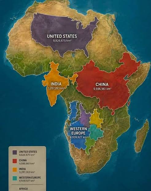
Size does matter
Human visual processing is inherently anchored to spatial scale. From early childhood development, cognitive psychology demonstrates that size is intuitively equated with importance, capability, and dominance - a mental heuristic known as the magnitude-valency association. In other words, size does matter.
When a child in Africa, South America, the Caribbean or South Asia views a standard Mercator projection, several cognitive distortions take root:
• The Bigger-is-Better Heuristic: Subconsciously, larger geographic entities are processed as "more central," "more powerful," and "more historically significant." When Europe appears roughly equal in size to Africa (despite Africa being three times larger), or when Greenland appears as vast as the entire African continent (despite Africa being 14 times larger), the brain builds an inaccurate structural baseline for world geography.
• Marginalization of the Center: Because the Mercator projection pushes equatorial regions to the visual background while pulling northern latitudes into exaggerated prominence, students in equatorial nations literally see their homeland as compressed and secondary - a spatial periphery orbiting a massive northern center.
• Confirmation Bias in Social Studies: When reading history, economics, or literature, students subconsciously map cultural achievements onto physical scale. A physically diminished continent or territory makes the historical narrative of external dominance feel natural or inevitable, rather than the product of specific geopolitical choices and historical contingencies.
Psychological Impacts: Decolonizing the Visual Self
The psychological impact of cartographic distortion operates through mechanisms of implicit bias, visual socialization, and national self-perception.
1. Internalized Spatial Inferiority
Just as language and media shape identity, cartography functions as a visual language. When educational systems rely on distorted projections, students in the Global South internalize a subtle form of spatial erasure. The physical shrinking of their nations mirrors historical narratives of disenfranchisement. The physical world itself appears to legitimize their peripheral standing in global trade, politics, and innovation.
2. Normative Centrality of the North
The default placement of Europe and North America at the top-center of flat projections, combined with their magnified scale, establishes a "normative baseline." Students grow up viewing the Global North as the default locus of human activity, progress, and governance, while their own regions are framed as geographic and developmental addendums.
3. Disconnect Between Lived Experience and Representation
For students in vast nations like Nigeria, Brazil, or India, there is an unspoken dissonance between the immense physical diversity, distance, and scale of their lived environment and its visual representation in textbooks. This disconnect can foster a subtle cognitive alienation - a feeling that the "official" world recorded in academic literature does not truly account for or value their local reality.
Pedagogical Implications
Correcting cartographic distortion in classrooms therefore goes far beyond teaching accurate land measurements; it is an exercise in decolonizing the educational imagination.
When schools adopt equal-area projections like Equal Earth, teachers observe immediate shifts in student engagement:
1. Reclaiming Scale: Students express surprise and empowerment upon discovering that their continent can comfortably hold multiple global powers within its borders.
2. Ecological Realism: Understanding true geographic scale helps students accurately appreciate the sheer size of vital local ecosystems - such as the Amazon or Congo Basins - fostering a stronger sense of environmental stewardship and global relevance.
3. Critical Spatial Literacy: Teaching why maps are distorted introduces students to critical thinking, helping them understand that no data visualization is entirely neutral and that tools of knowledge can carry historical bias.
By aligning visual education with scientific and geographic reality, educators in the Global South provide students with a visual framework that honors their physical presence on the planet - replacing inherited, Eurocentric distortions with visual parity and cognitive self-worth.
How does all of this affect St. Martin?
Quite often we hear about this or that individual or group/team “putting St. Martin on the map,” as if they were cartographers who realized that the island was missing on the world map. Similarly, it has become customary for us to refer to St. Martin as a “small” or “tiny” island.
The psychological impact of this is to further minimize our island’s importance. But if we were so “small” why would The Netherlands and France continue to hold on to us for FIVE centuries? Why would day, just the other day, formalize the partition of the island in a treaty?
However, this “small” mentality is not limited to St. Martin but extends to the wider Caribbean region. Interestingly enough, nobody would call The Netherlands “small” although its population is about the same as that of the Dominican Republic, while it has a smaller area than Nasarawa, one of the smallest states in Nigeria.
To put this in greater perspective, St. Martin is more than 37 times bigger than The Vatican and Monaco combined. It is also about one and half times the size of San Marino. That is geography! How often do we hear “small” or “tiny” used to describe those European states?
I rest my case.